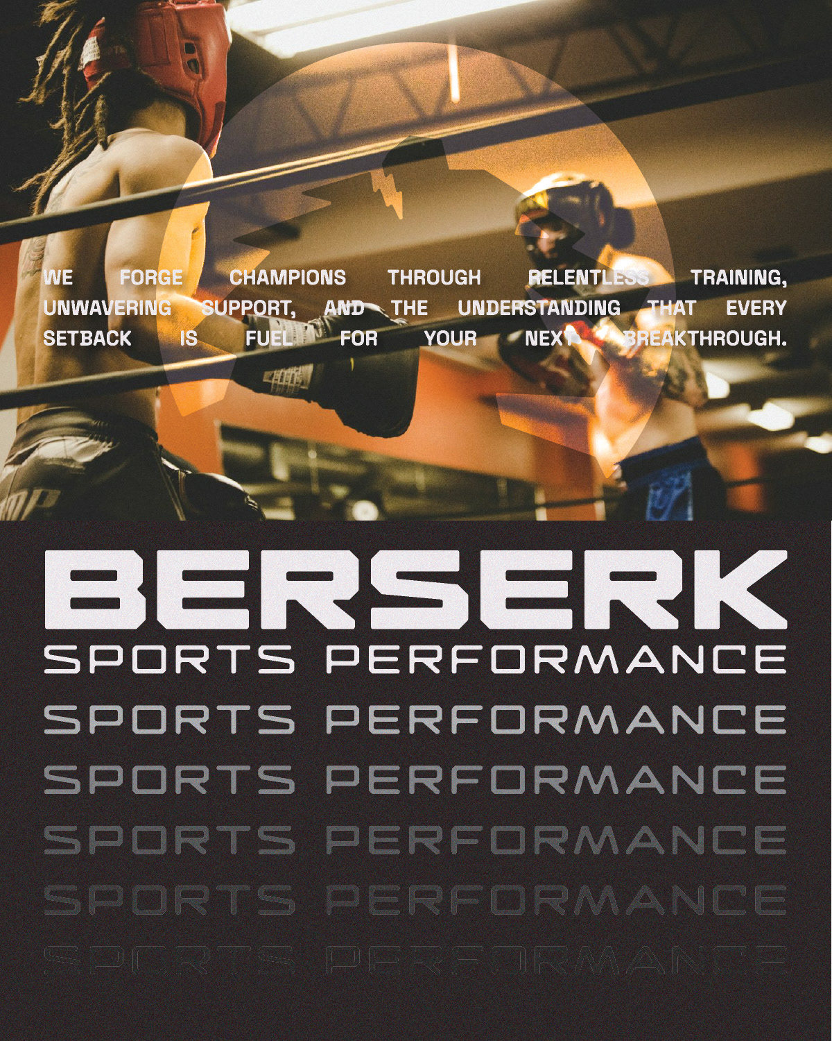
A proposal for a training facility in El Segundo, Calif., Berserk Sports Performance.
Building a brand for athletes who train like warriors isn’t your average gym gig. Berserk Sports Performance needed an identity that could go just as hard as their training programs. We started with the etymology - ‘ber’ (bear) + ‘serk’ (shirt) - those Norse warriors who fought with primal intensity.
Building a brand for athletes who train like warriors isn’t your average gym gig. Berserk Sports Performance needed an identity that could go just as hard as their training programs. We started with the etymology - ‘ber’ (bear) + ‘serk’ (shirt) - those Norse warriors who fought with primal intensity.
We leaned into that warrior ethos but gave it a tech-forward edge to signal next-gen performance training. The wordmark needed to feel powerful, whether it’s on a water bottle or spanning an entire facility wall. We pulled visual cues from angular, dynamic geometry, and digital interfaces—sharp lines, bold weights, precision. Every element is built to communicate one thing: this is where you push past limits.